Cool Color Scheme Theory for Home Decoration
Hello everyone, we meet again to discuss a color theory for home decoration. In the previous article, we have learned about the warm color scheme for home decoration. Now, we will continue to study color theory about a cool color scheme for home decoration. Let’s get started.
The colors from the cool side of the color wheel are far from the cold impression. Most of the cool color scheme can be combined easily. There are several striking colors in this group, which makes it “safe colors” on which to base a color scheme.
Cool Color Scheme: Green, Blue, and Purple
Green
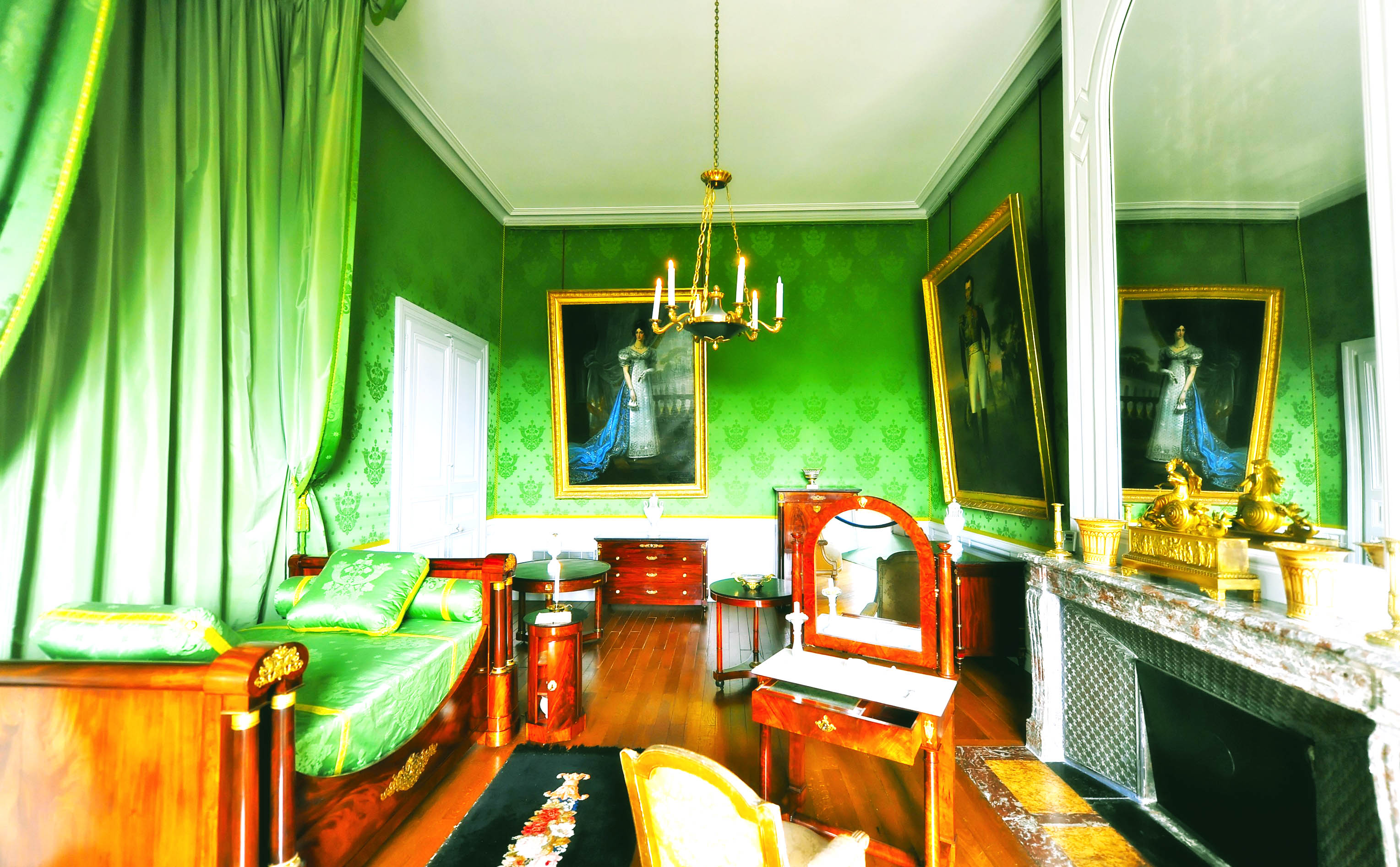
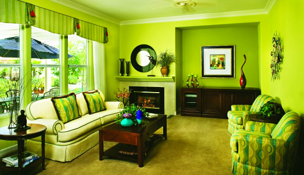
Green is the color of balance, position among the warm colors and cool colors in the color spectrum. Green is the color of nature and to ensure the impression of “landscape”, making it the right choice for an apartment in the city center, or a modest villa in the village. However, the green could turn out to be very cold, especially when it contains elements of blue. However, the combination of green with contrasted warm colors will eliminate the cold impression.
Pale green hue will create a broad impression of bathroom and bedroom were small. When the green lead to the blue color, it will be the color of mint, very refreshing in the kitchen. Shades of dark green looks rich and magnificent: the color of malachite green or dark green forests suitable for both traditional and modern styles.
Green with elements of gray will look very soft. Sage and an olive green color are very elegant and beautiful look into the rooms of country-style pictures, classic lobby, or modern dining room. However, like yellow-green, this color requires good lighting so that not too dark at night.
Blue
Blue is the color of harmony, peace, and loyalty. Blue is associated with the sky and the bird’s-eye view (panorama), as well as creating the impression of relief. Because it is cool, use this color carefully. Low levels of light reflectance will spread and soften the strong sunlight, “calming” the rooms that are too bright. However, blue light also cheerful, which makes it ideal for children’s rooms, urban-style living room, or kitchen in the basement.
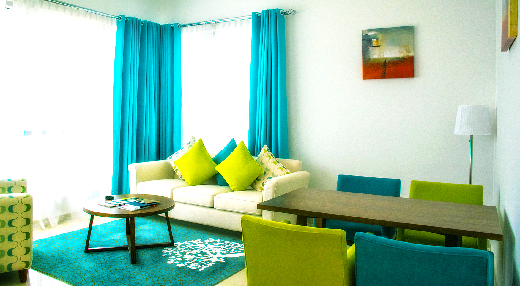
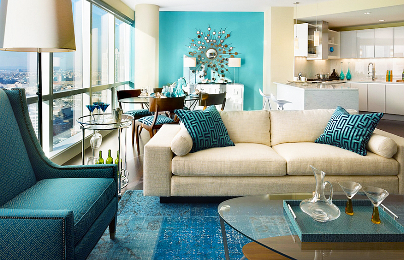
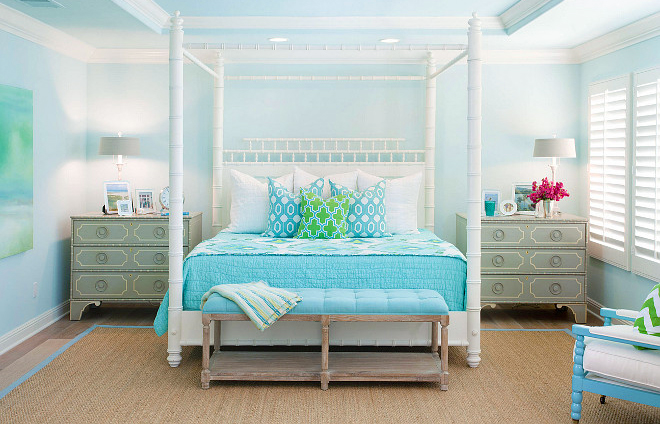
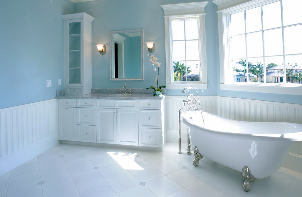
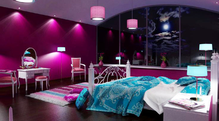
Pure blue, especially those who began to lead to peacock green, turquoise-hard combined with other colors. Use a small amount if you have a small room. Bright colors, like aqua blue, the nuances of freshness very suitable for bathrooms and kitchens
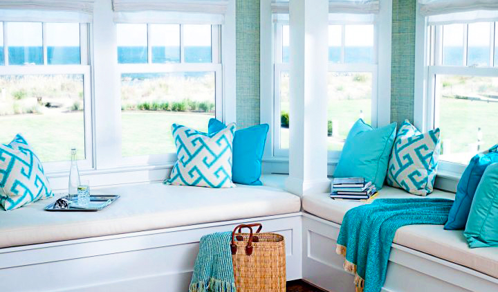
Using blue as the primary color in interior design and makes the blue as the colors blend with other colors still not reduce the aesthetic value of the blue color itself
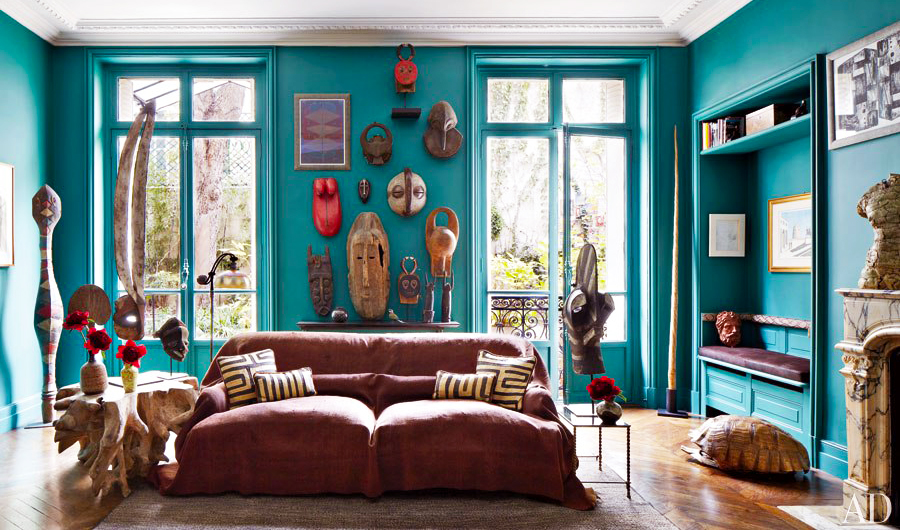
Use other colors in the decor, such as chairs, tables, and accessories. It was as “brightener” for the blue color
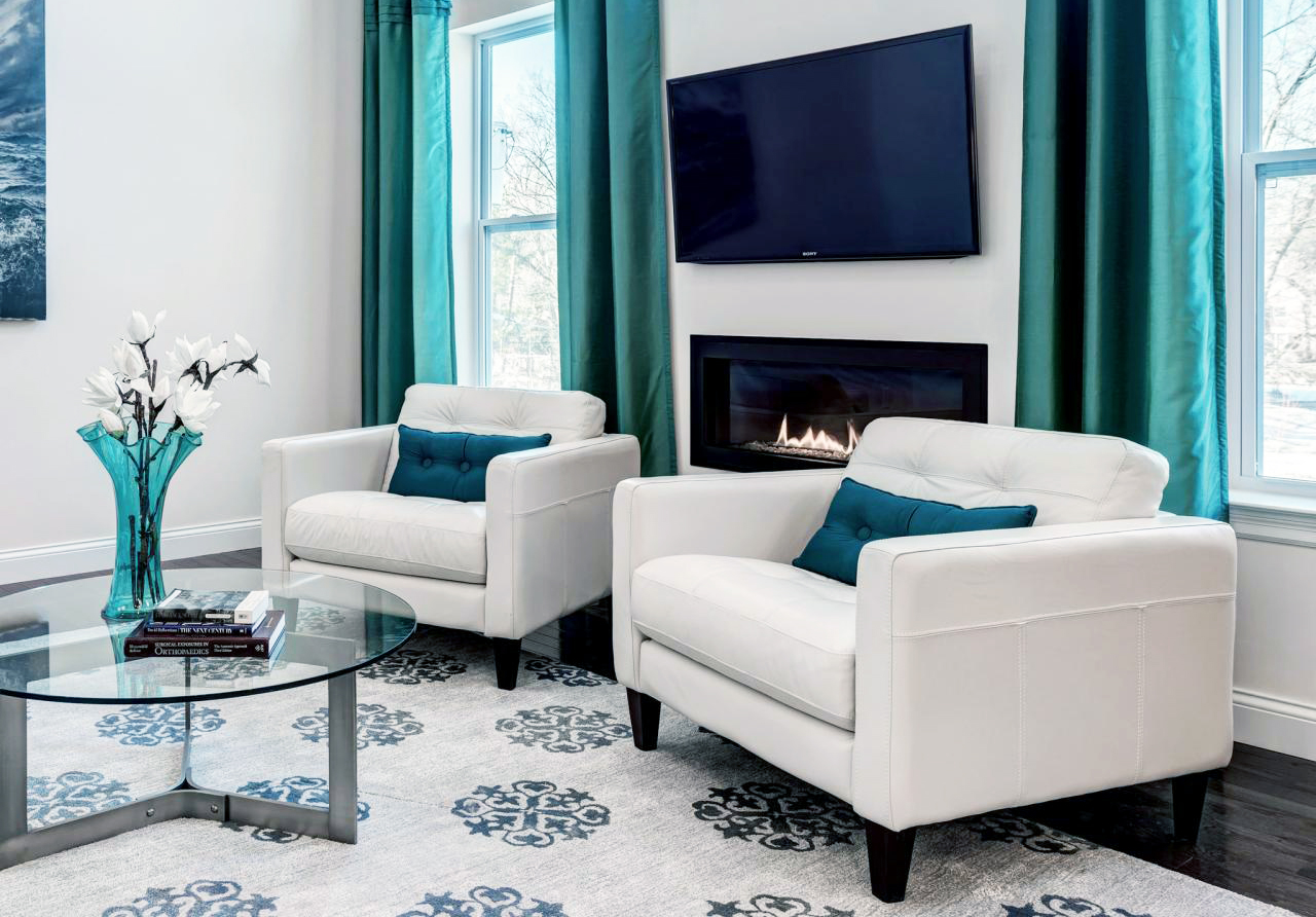
The blue color with elements of gray and blue shades give a soft impression, but it would be boring if the lighting is inadequate. These colors are extremely effective when combined with crisp neutral colors like white and beige, or warmed with contrasting colors, such as orange, yellow and bright pink.
Purple
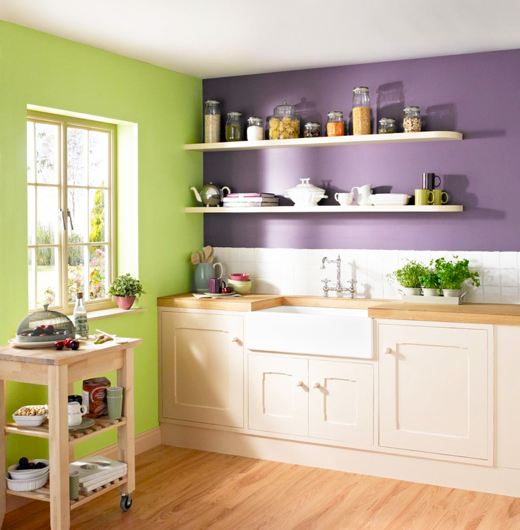
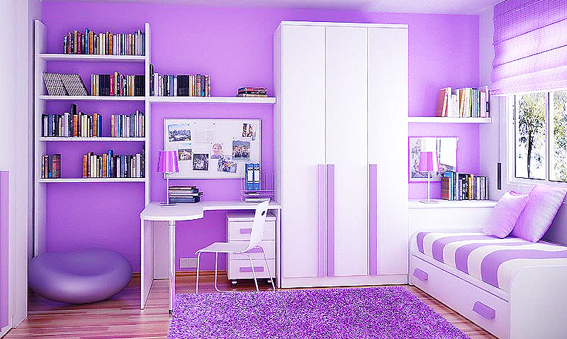
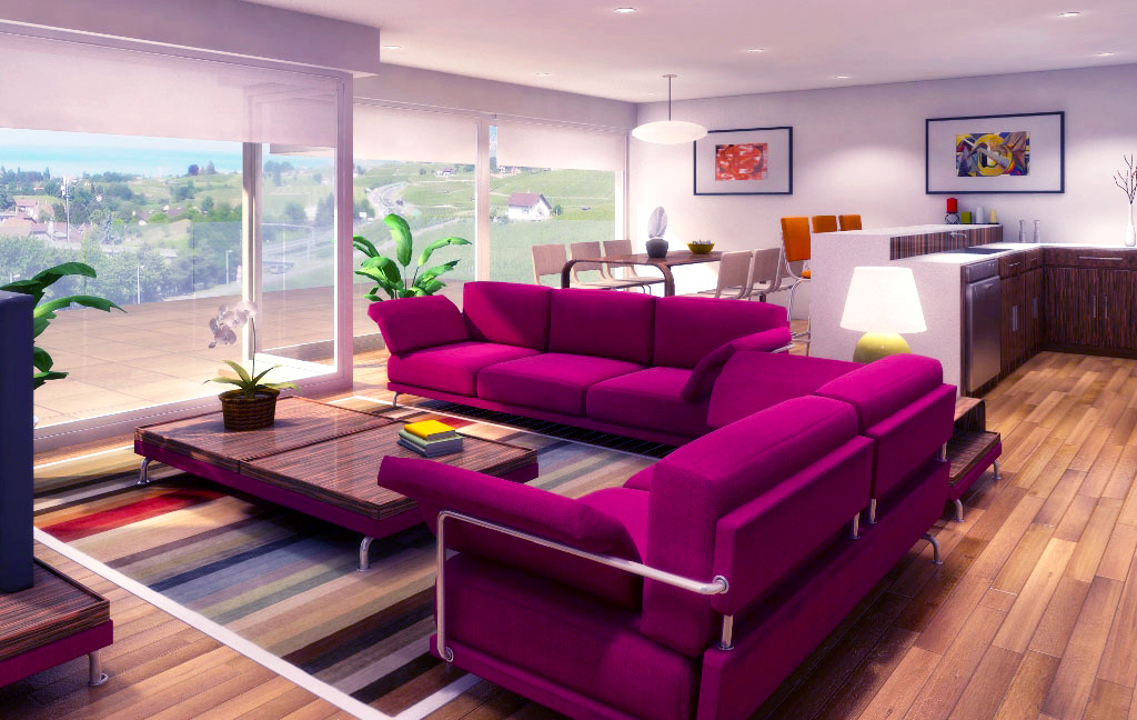
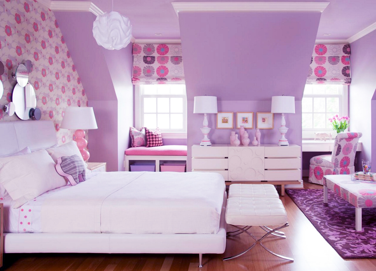
With the strongest gradation, royal purple (regal purple), is the lighted color and not easily combined with other colors. Purple is perfectly paired with blue color, turquoise and pink purple. Pale purple tint gives a romantic feel to the bedroom and bathroom, and the impression of luxury in the family room. Tint purple that more easily give the impression of heather can change the hue in different lighting. Shade purple produce plum color that matches when combined with gold, beige and pale yellow in the living room or dining room.
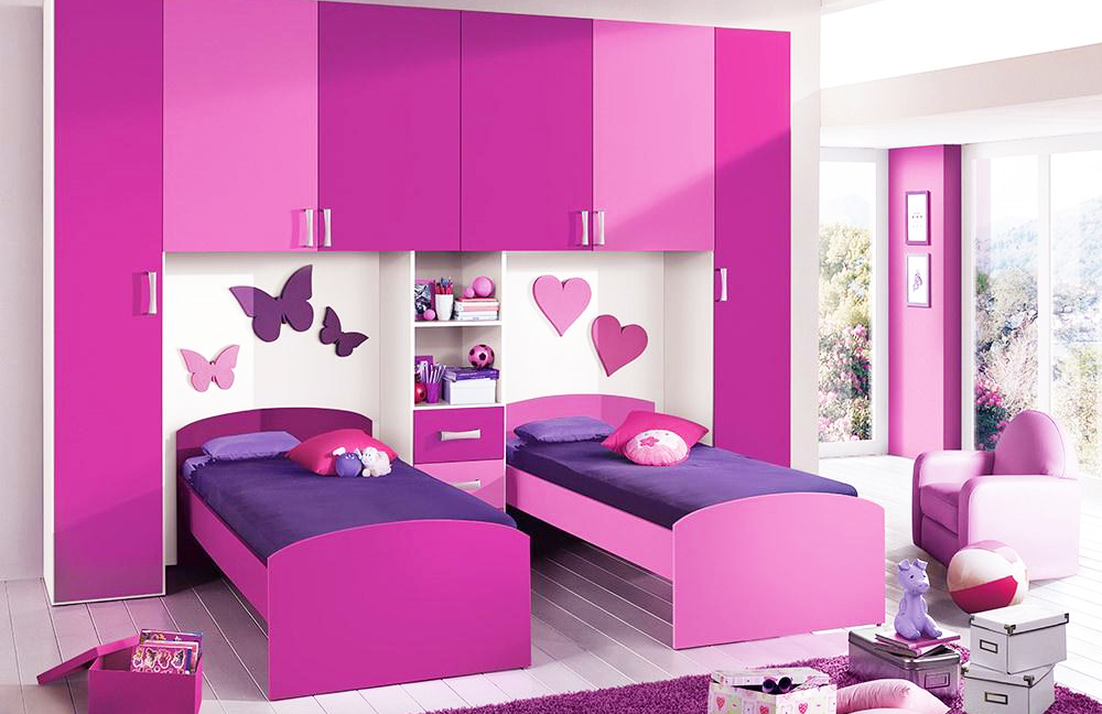
With the various degradation purple, because purple color also has a variety of different types of color density
Alright, that is enough for today about cool color scheme. But, in another time we still continue talking about color theory for home decoration. So, that is cool color scheme theory for home decoration. Hopefully, this article can helpful for the readers. Thank you for visit our blog. Do not forget to share this article for helpful the others readers.


