How to Create a Harmonious Color Scheme
Ok, we see again in this good time, with still continuing our discussion of color theory. In previous articles, we’ve studied the theory of the cool color scheme for home decoration. In this article, we will discuss about the colors combine into a harmonious color scheme. Well, let’s get started.
Create a harmonious color schemes for the home decoration easier when you an equipments. One of the equipment is color wheel. The color wheel is a very important tool. The color wheel illustrates the natural complementary colors and color contrast of each color and ready to be used as guidelines for combining colors. Use a color wheel as a guide to find combinations of unique color.
Harmonious Color Scheme and Contrast
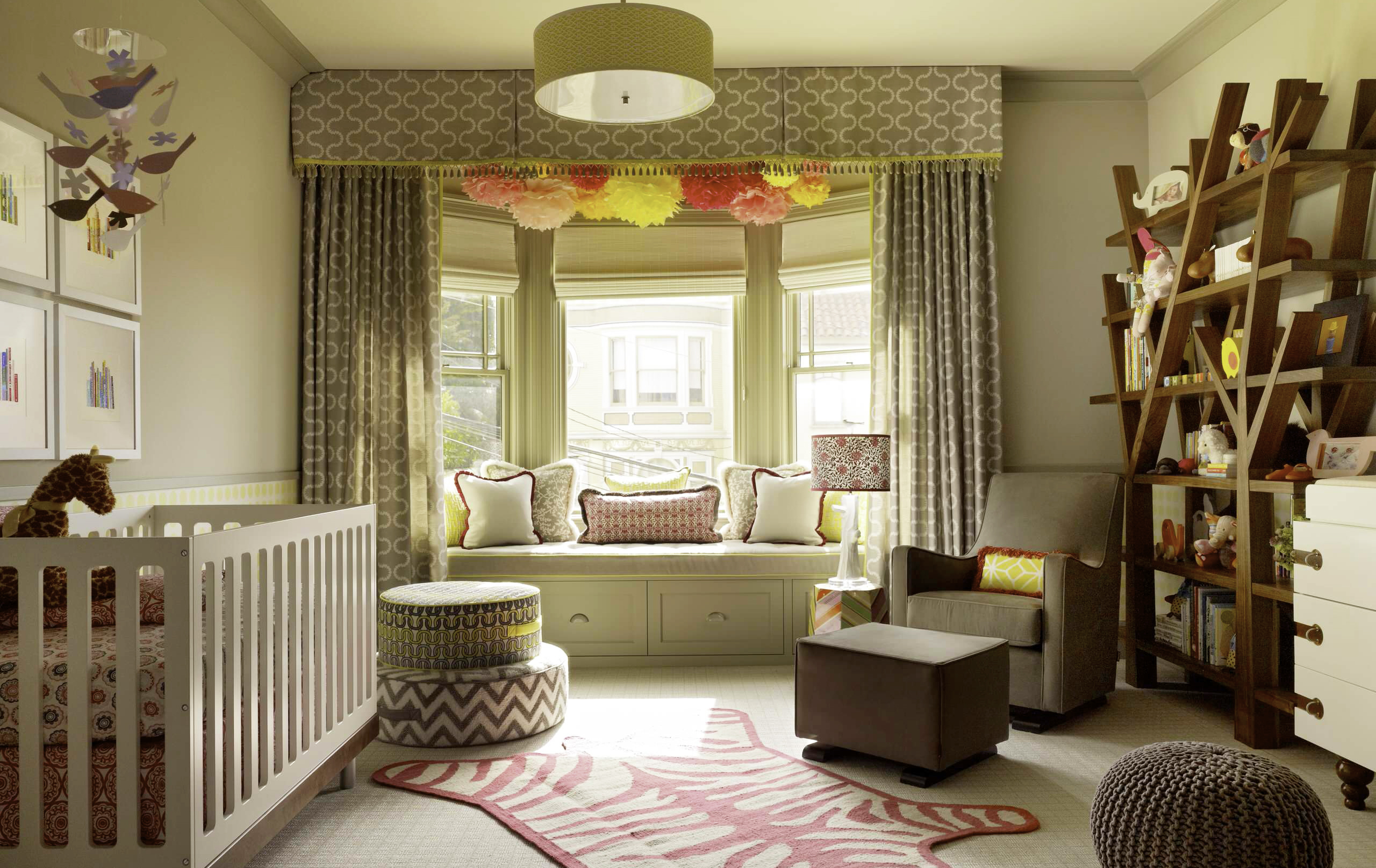
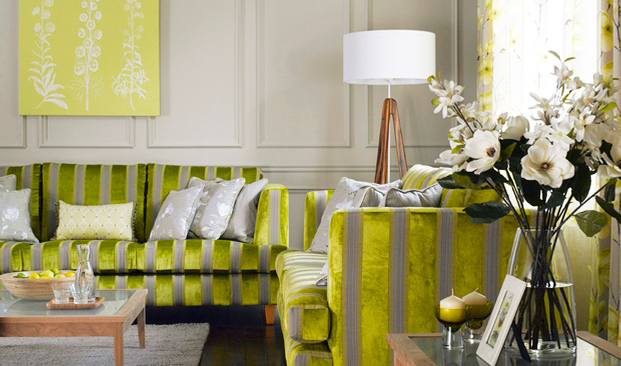
Harmonious color scheme are colors that are adjacent on the color wheel. If combined, the colors will create a soothing atmosphere. The variations of harmonious color scheme that more hard is mixing a single color with the lightest color tone to dark, without going out to other parts from the color wheel. This way will produce a monochromatic scheme, and also gives a feel calm and comfortable.
Designing a Monochromatic Scheme
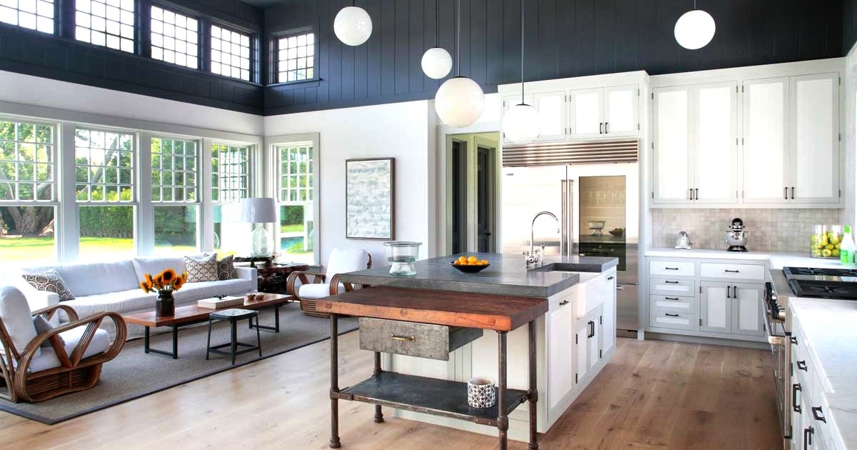
There were several things about the home interior design, from the room shape, the room arrangement, furniture, until the room color
As a guideline, use paint color sample cards. These cards can be found in the paint shop. Maybe you will find some cards featuring all the variations of one type of color, that gives a lot of options. The palest of a color can be used on wood, and the darkest shades to the floor surface. Search also paper and fabric that will use different shades of the same color.
You will find that most of the monochromatic scheme requires an accent color to make it brighter. Look back in the color wheel to see any pattern that contrasts with the color of your choice.
Contrast Colors
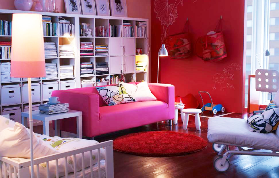
In choosing a paint color, you can use the bedroom wall paint color accordance with the theme of the room
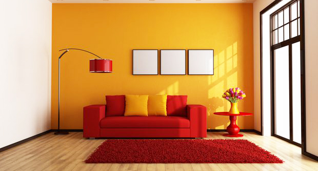
Colors contrasting or complementary colors are colors that are opposite position in the color wheel. By choosing contrasting colors, you automatically have to combine warm colors with cool colors. If you look closely, a strong shades of warm colors (red, for example) for one minute, then look away, you will see a color “continuation colors” opposite (green). Eyes had a strange trick!
When combined together, contrasting colors can be evocative and exciting, but if the intensity of each color is too light, the results can be disturbing. Contrasting colors too bright, the results can be disturbing. Contrasting colors covering all colors in shades, hues, and nuances. Therefore, a scheme which is based on the color of sugar pink and olive green, or turquoise with terracotta, for example, will remain visible contrast, but not too flashy. Contrasting colors that are already weakened like this is suitable for rooms where you do not want to overly relax, but also do not want to get too excited by the colors.
A color scheme that contrasts each other can also complement each other, using a basic color that is combined with two tertiary colors on the side of contrast color, such as blue with a red-orange and yellow-orange.
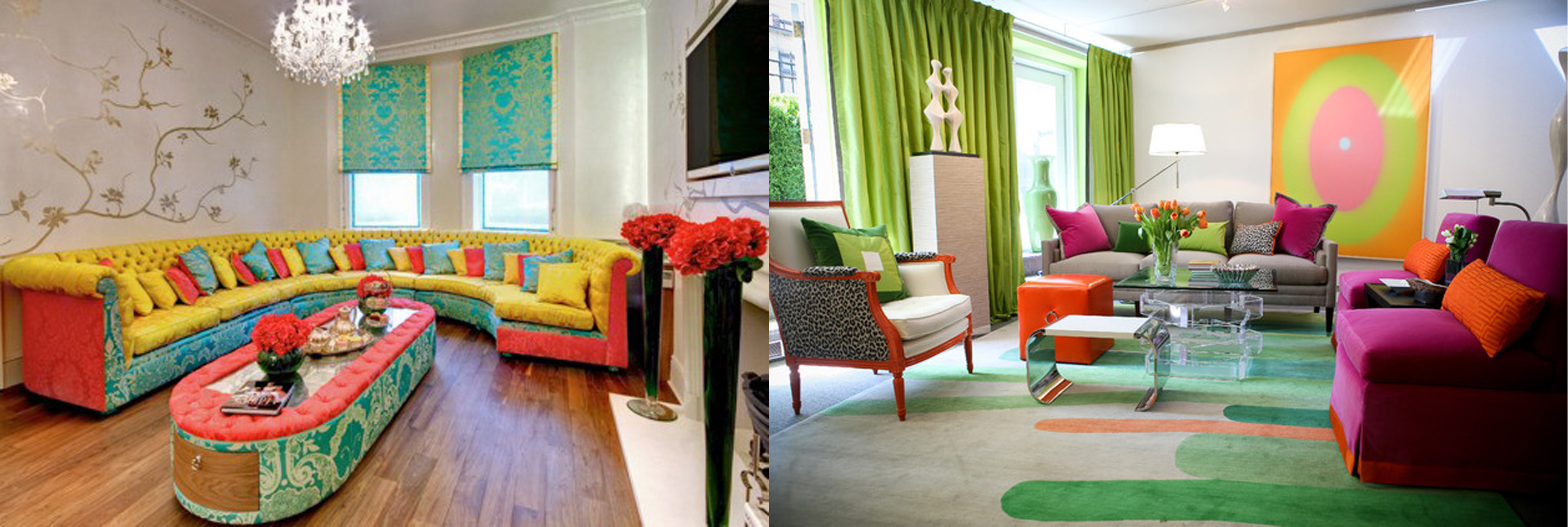
If we talk about the colors, of course, a lot of color choices that we can apply in our living room like red, green, blue, purple or any other color, we can integrate or combine the colors in order to create or beautiful colors
You can also create a scheme of contrasting colors that are just as good without having to use two colors are opposite each other directly, as long as you combine warm colors with cool colors, such as blue with yellow, orange with jade green, or green with purple.
Creating a Harmonious Color Scheme
Harmonious color scheme does not happen just like that. All need to be planning. Because no one can sense the color exactly, therefore it is necessary for accurate color matching. The best way to do that is to look at examples of the materials that will be used, observe it in the room that will be used, both in daylight and under artificial lighting.
Utilizing Things that Already Exist
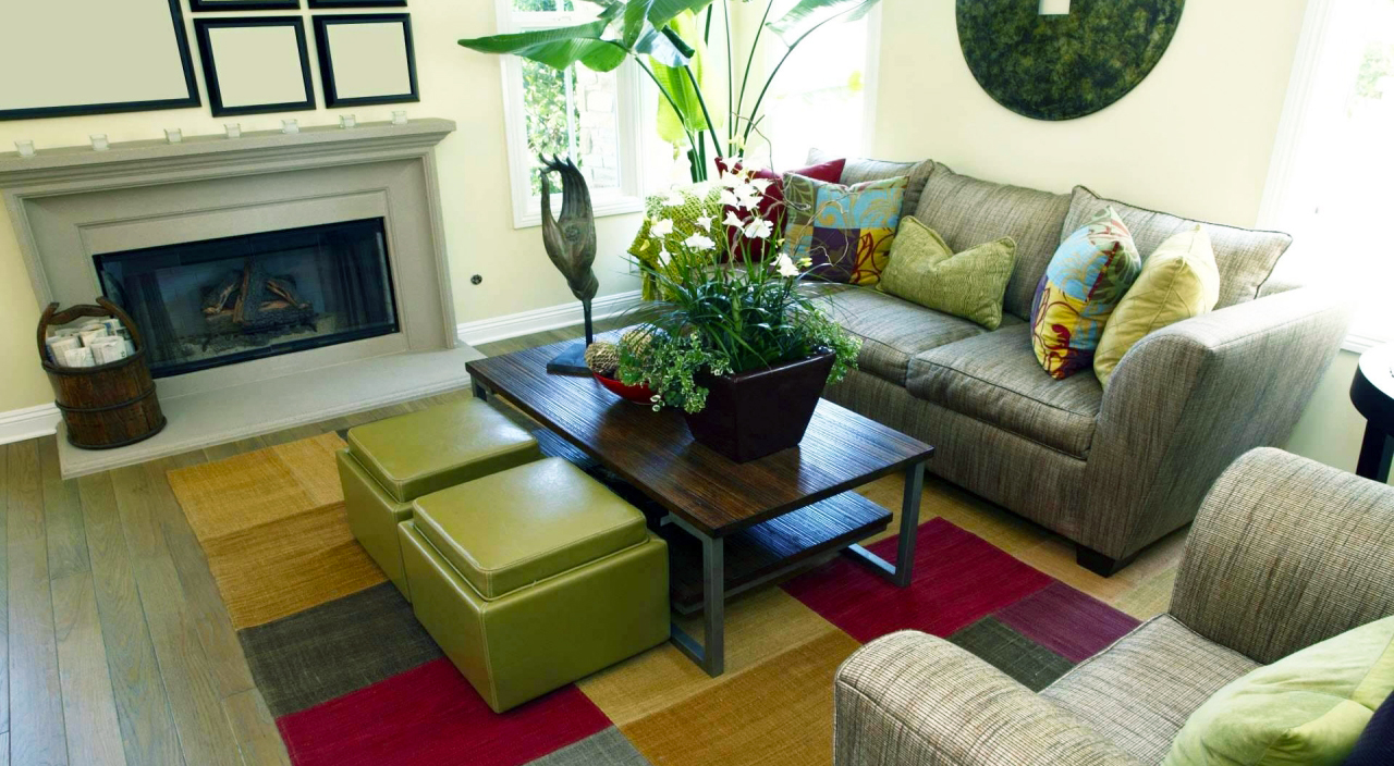
Choosing the furniture and walls paint, everything will work together in creating beauty in that space
Ideally, you can design the color scheme without slightest obstacle. However, in reality, most of us have to adjust the new color scheme with the objects that already exist such as the bathroom, kitchenware, or sofa.
All rooms have characteristics that already exist and can be used as a starting point a color scheme.
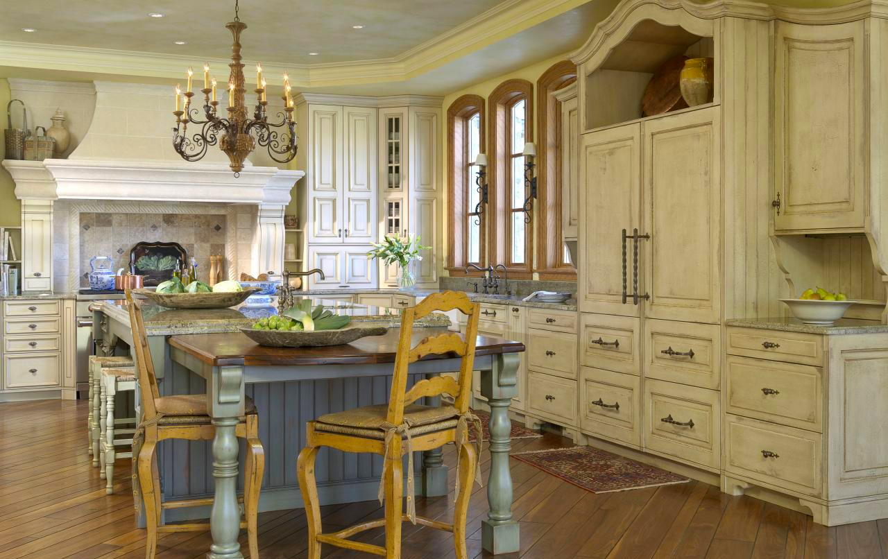
- The architectural style, this style includes the overall style of a room, and characteristics that attract duly highlighted. To create an attractive fireplace need to be given an affirmation. So, the curve of chimney jutting into the room that can be colored with bright dark color to accentuate the soft colored fireplace frame, or paint pale color that contrasts with the dark environment. If the room has beautiful windows, arrange with simple enough to maintain its natural shape.
- The room orientation and the amount of sunlight received. For the room who did not receive enough sunlight in the morning, choose warm colors. While for the room which are bathed sunlight in the morning, where it will be cold and dark at night, would be better suited with a choice of color “sun” rather pale. The rooms were bright and warm from the day onwards matched by cool colors and faded.
- The room size, the rooms are small could cause the claustrophobia if using sharp colors. It would be better if you use pale colors and cool like blue, green, and lilac, or neutral colors to create the impression of wider space. Adding sparkling texture and mirror to reflect the light will help make the room seem more spacious. If you arrange the room was very spacious, use contrasting colors and sharp, or striking patterns, to create the effect of a more convenient.
Balancing the Color and Pattern
Harmonious color scheme make your home decoration balance. It’s important to align the color combination and the pattern size with the scale of use. Bright colors, bold patterns, and striking will look twice as strong on the surface floor or spacious wall. Bright colors, bold patterns, and striking will look twice as strong on the surface of the floor or wall spacious. Therefore, observe the sample color and the pattern size. If you plan to paint the walls, test first on a piece of long paper, and attach the paper to the wall of the room for a few days.
Small patterns produce very different effects when viewed on a large scale. Therefore, do not judge a pattern based on a small-scale example. The small pictures will be blurred, and actually will highlight the texture impression, not different patterns when applied to the entire wall.
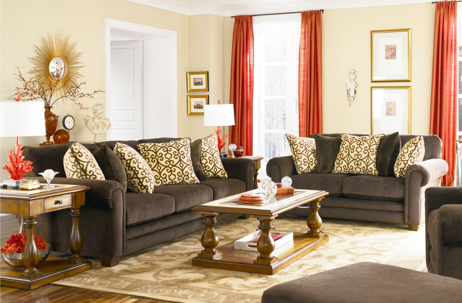
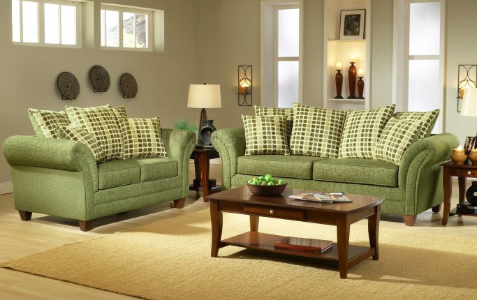
The family room is one place in the house of the most fun because you could say that’s where the heart of a home
Combining the patterns is one of the most a smart scheme to be successfully applied. Use the sample board material to experiment with various effects. The use of color range that are too broad will make the blend pattern into a mess. Therefore, look carefully at each of the colors to be used in the design, and look for patterns that have a similar color scheme.
Do not rule out an important role of neutral colors for the balance of the whole scheme. In fact, the schemes are rich and colorful yet still rely on white or cream color to show the contrast, to emphasize the brilliance of other colors, as well as to avoid saturation of the senses.
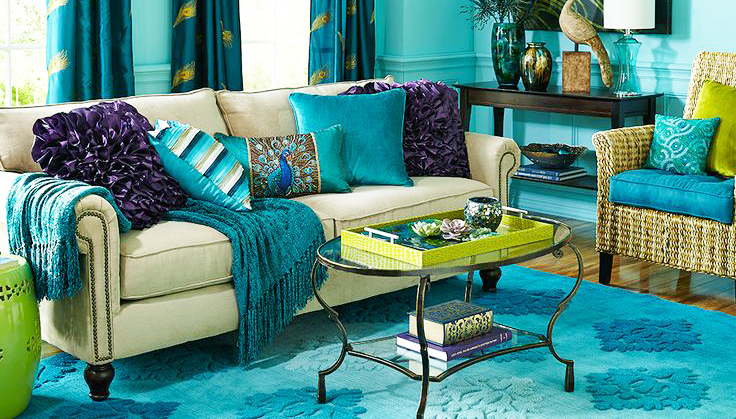
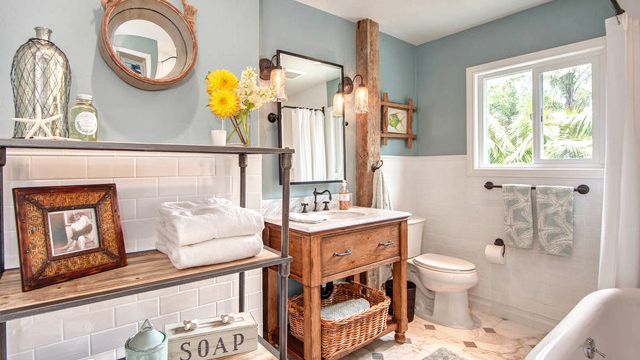
Choosing the blue color scheme for the interior does not necessarily make the house look gloomy because you can evade by selecting the blue shades lighter or can also use a faded blue sea create the impression of a refreshing and calm
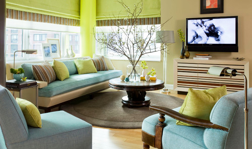
Cool color scheme became one of the color trend this year you can choose to create a new atmosphere that is comfortable for example in the living room, family room or bedroom
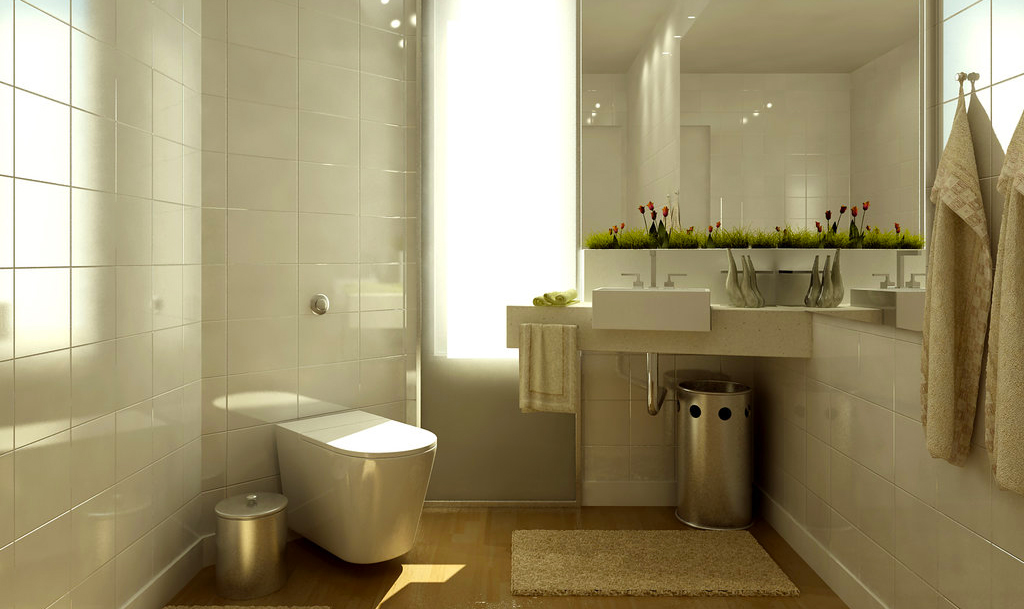
Usually after knowing what colors to use, the next stage is implementation on the element of color interior elements, such as furniture, flooring, walls and ceiling
The next article will discuss the visual tricks with colors. This will be a fun and interesting discussion, how to create color a illusions for make the room beautiful and comfortable. So, that is how to create a harmonious color scheme. Hopefully, this article can helpful for the readers. Thank you for visit our blog. Do not forget to share this article for helpful the others readers

